risa
Introduction
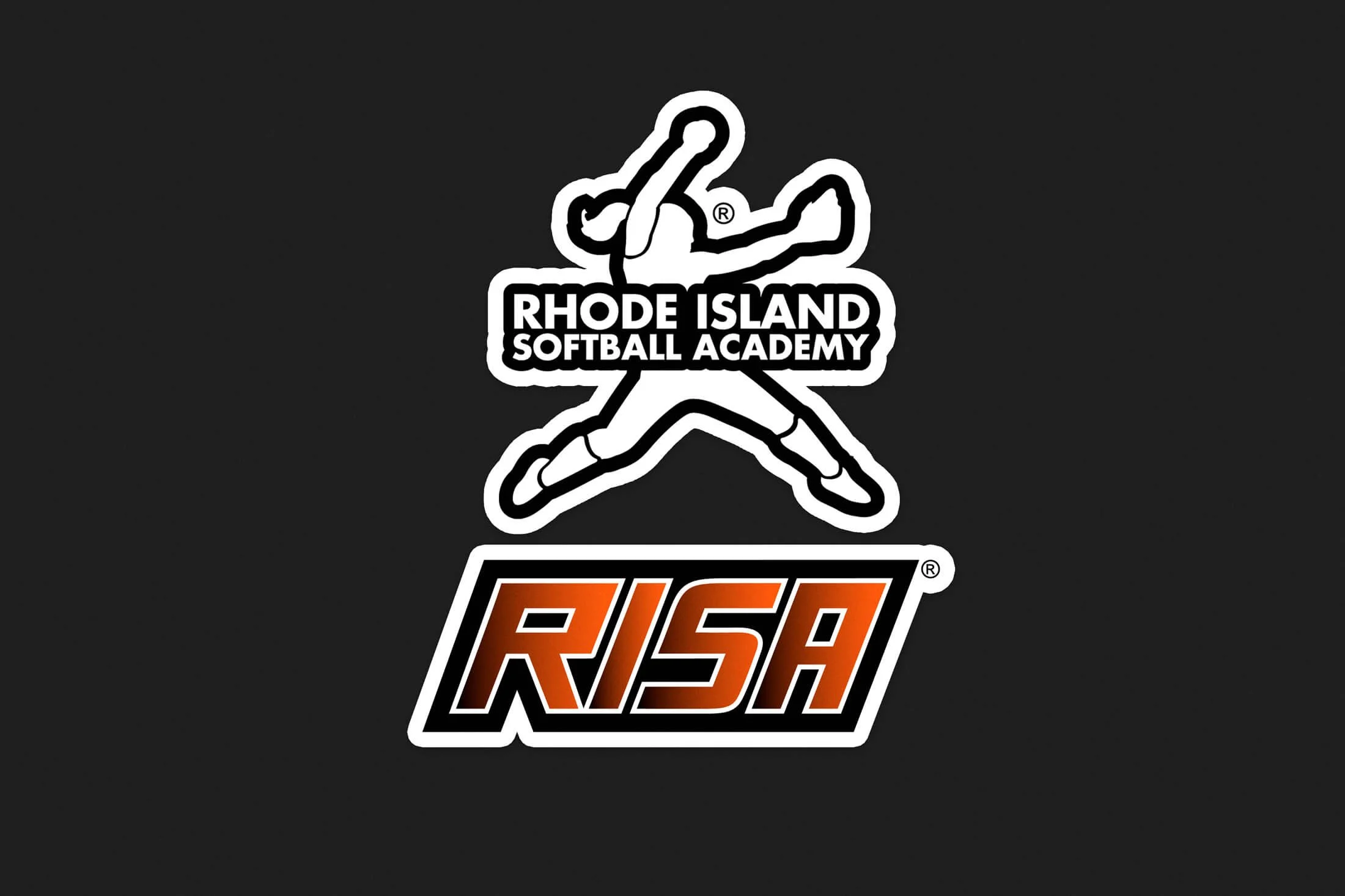
I was tasked with developing an original wordmark and alternate icon for a softball academy.
Problem Statement
Create a modern wordmark that feels athletic without looking old school.
Creative Process
I loved working on this wordmark and brand icon combo. I got to really flex my creativity and push past my limits. I started off with very rough sketches of hand drawn athletic type letters.

I aimed to capture energy by setting the letters at a slight angle. The initial concept included serifs, but through client collaboration, we refined the design by removing them — resulting in a cleaner, more dynamic wordmark.