HZRDUS


Introduction
Full branding project for HZRDUS - a streetwear/lifestyle brand targeted at the urban youth and creative entrepreneur market that blends modernity, professionalism, and a gritty post-apocalyptic street edge to inspire a lifestyle of living off of your art or other passions.
Problem Statement
The foundation for this project was to create a streetwear & lifestyle company that would engage creative urban youth and artistic entrepreneurs in a way that inspires and motivates them to always strive to find the path to financial freedom through a relentless pursuit of their passions and talents.
Creative Process
The first and most essential part of the creative process was the naming of the brand. I chose the name HZRDUS by creating a slogan for the brand. The slogan is "THE HAZARD IS US" and was accompanied in my sketchbook by a man in a business suit wearing a gas mask and smoke coming out of it.

This motto defines the brand's voice and the mission statement is as follows " Only our minds can keep us from achieving our dreams."
"THE HAZARD IS US," also serves as a reference to how we as a species are our own worst enemies because the brand wants to have a conscious voice that will inspire critical thought amongst its target market.
From this slogan and mission statement came the name HZRDUS. The idea behind the slogan and brand name working together is for when people read the logo and inevitably ask "What is HZRDUS?" The answer is... " THE HAZARD IS US," only our minds can keep us from achieving our dreams."

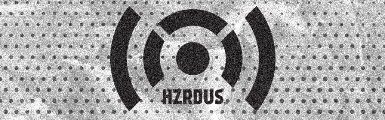
As for the main logo, the goal was an eye-catching logo inspired by the classic radiation "HAZARDOUS" symbol, the "bullseye target" logo, and elements of a radio wave signal icon to convey a sense of a message being broadcast.
Color palette
The branding leans heavily into black, gray, and white because the brand is primarily a screen-printed apparel-focused business, and by creating an identity around simple yet engaging and dynamic designs with a story to tell, it will capture the target market's attention while keeping production costs to a minimum. It also feeds into the bold yet minimal style of the brand and invokes a gritty noir feel in marketing and promotional imagery.


Bold use of black and white is also always in when it comes to street/urban fashion and there are plans put in place within the brand strategy that includes expansion into muted colors such as gold, maroon/burgundy, deep ocean blues, forest green, and other subtle colors within this vision. The strategy offered was to grow first, and then offer expanded colors for both loyal and new consumer-, but its core will always be that black-and-white gritty aesthetic.
Branding Elements
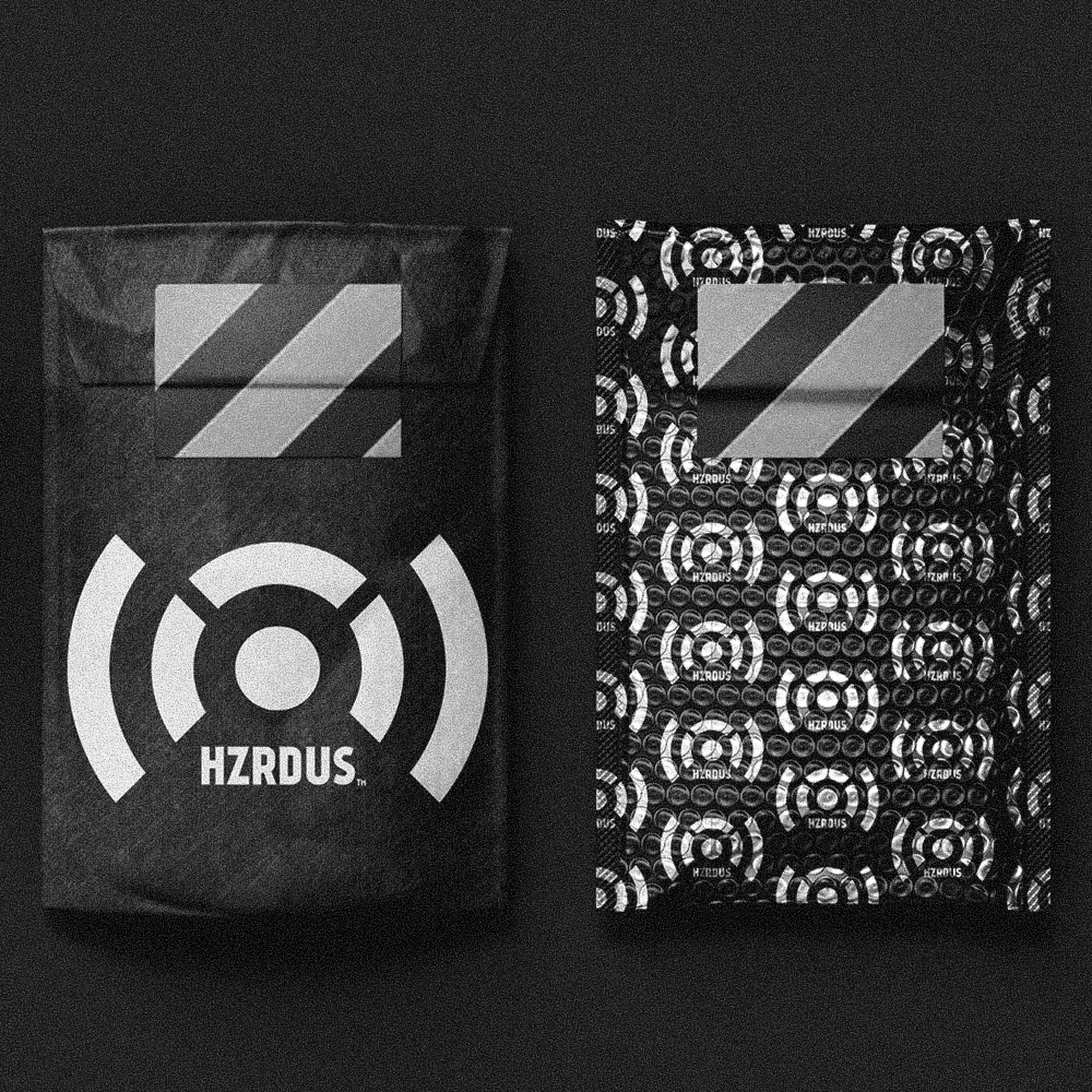
As part of the complete branding effort I also developed designs for alternate logos including an alien mascot logo and an anchor logo to represent the brand's Rhode Island roots, packaging for mailing shirts and apparel, business cards, stickers, t-shirt hem tags, apparel mockups, and clothing hang tags.


Result & Impact
The first run of HZRDUS merchandise sold out within 3 weeks. The second run of HZRDUS merch sold out in 5 weeks. Follower count on social media increased by 20% over 3 months. The HZRDUS brand was also able to attract multiple local creatives as brand ambassadors.
A local photographer offered the HZRDUS brand a free photoshoot because he believed in the message of HZRDUS and it's branding. HZRDUS was also featured in a regional New England magazine in 2015 for it's message and branding.