risa


Introduction
I was tasked with developing an original wordmark and alternate icon for a softball academy.
Problem Statement
Create a modern wordmark that feels athletic without looking old school.
Creative Process
I loved working on this wordmark and brand icon combo. I got to really flex my creativity and push past my limits. I started off with very rough sketches of hand drawn athletic type letters.
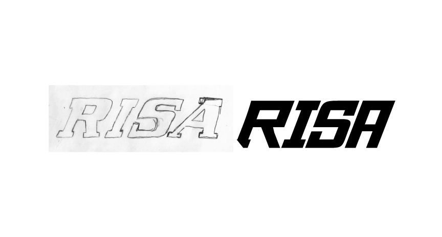

I aimed to capture energy by setting the letters at a slight angle. The initial concept included serifs, but through client collaboration, we refined the design by removing them — resulting in a cleaner, more dynamic wordmark.

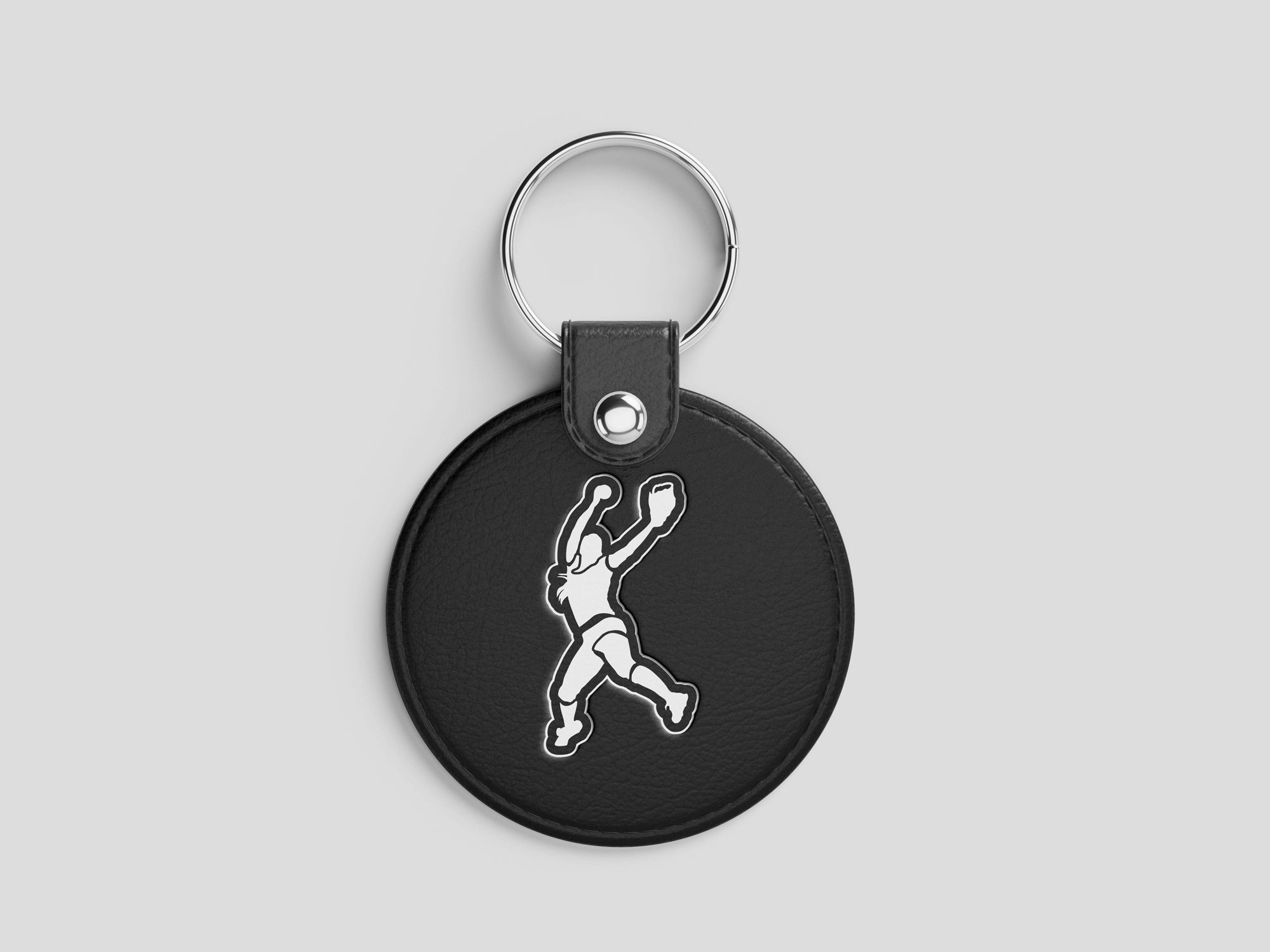
The brand icon also came out great capturing dynamic pitching motion. I found great reference images and hand drew a silhouette while including dynamic depth through line weight and contrast. I feel I really captured the feeling of a pitch being sent out to you.
Result & Impact:
100% original, premium athletic wordmark and brand icon — hand-crafted and unique .
Designed to stand out as truly unique and memorable.
Project completed Summer 2025 — impact data stats loading…